

This time, I will tackle a title sequence from Upload.
Upload is an American science fiction comedy-drama television series created by Greg Daniels. The story takes place in 2033, when humans can "upload" themselves into a virtual afterlife of their choosing. When a programmer Nathan Brown dies prematurely, he is uploaded to the luxury Lakeview facility, but then finds himself under the thumb of his possessive, still-living girlfriend Ingrid who has paid for him to be there.
It is quite a funny series, and is geek adjacent. It is worth checking out!
The title sequence
Below is a clip of the title sequence from episode 2 of season 1, which we will be making.
The title sequence mimicks an upload progress bar, slowly revealing the name of the TV series as it goes. The text is transparent and underneath it shows an image, which is the first frame of the opening scene. People usually refer to this as "knockout text", that is text that appears cut out, such that you can see a background behind it.
Just before the name is fully revealed, it glitches, and then flies past the viewer to reveal the opening scene.
TLDR
Here is the codepen with the final result.
Give it a ❤️ on Codepen if you like it! 😊
Design considerations
After searching a bit, I found that Paytone One was a good match for the font of the title text. It is available on Google Fonts.
The central part of the animation is the knockout text. There are a number of ways you can achieve this effect and it would be great to do it in CSS entirely, but there are some catches:
- The knockout text moves towards the viewer while the background remains static. This rules out techniques that apply the background image to the actual text, such as using
-webkit-background-clip: text;. - The glitch effect has colourful elements between the background image and the text. In order to do this in the least complex manner, it is preferable to have the background image as a separate element to the knockout text, and be able to place whatever we want between them. We could use a
clipPaththat contains a duplicate of ourtextelement, and apply it to the glitch elements. This ensures that there will be no overflow. However, we may need to apply the animation that moves the text towards the viewer to theclipPathto keep things in sync, even though the glitch is quite brief (300 milliseconds or so). It would be more performant if we don't move the glitching elements at all, and just animate their appearance.
With this in mind, I think it would be easier to bake in the "knockout text" inside a vector graphics editor. I can turn the text element into a SVG path and combine it with a black rectangle to create a single path.
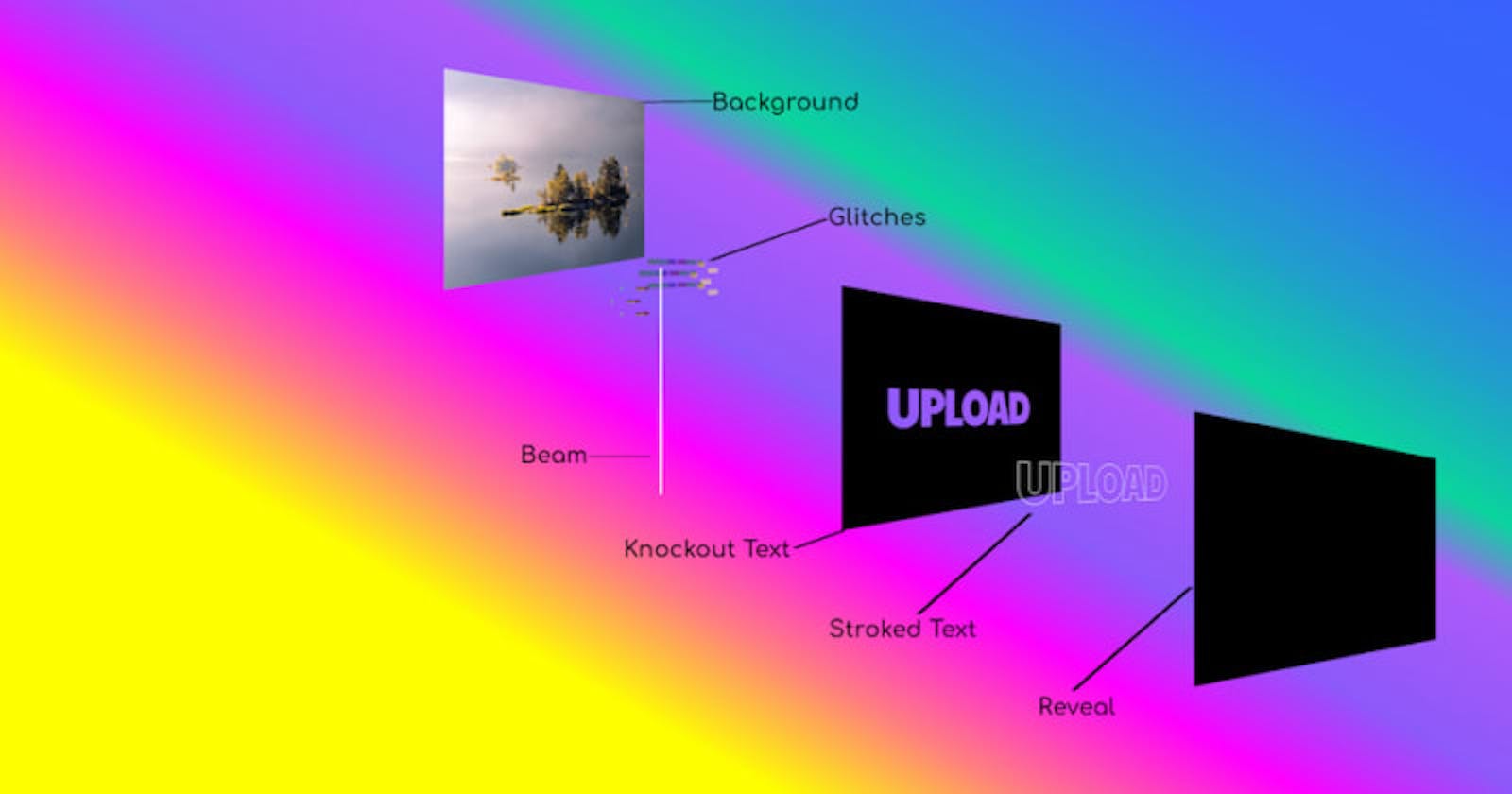
Here is a visual overview of what we want to create:
 This is a cross-section of the elements that we will create from back to front (left to right).
Making the SVG
We will create the SVG by hand initially. We want a landscape SVG, so we can create this with a viewBox that specifies the width as 1200 units, and height as 800 units. We want a black rectangle that will fill the entire canvas, so we give it a width of 1200 and height of 800.
We will add a text element and position it towards the center of the canvas, so we can see it! We specify our font via the font-family attribute. We will pick a big font-size to begin with to see how it looks, and give it a fill of white, so that we can see it against the black rectangle.
<svg viewBox="0 0 1200 800">
    <rect x="0" y="0" fill="black" width="1200" height="800"></rect>
    <text x="600" y="400" font-family="Paytone One" font-size="100px" fill="white">UPLOAD</text>
</svg>
Now, we can open this up in Inkscape (or your favourite vector graphics editor). If you are using Inkscape, I recommend installing the SVGO plugin for Inkscape. This will enable you to optimize the markup when you save the file.
I will guide you through creating the SVG in Inkscape.

First thing that I check is the document properties. On the menu, go to File, then Document Properties... It opens up the following tab.

It appears the canvas dimensions are a bit small, it is 300px by 150px. Let's change that to 1200px by 800px to match our viewBox.
Now, let's look to size and align the text now. First, we can try some bigger font sizes by clicking on the text tool (press the letter T to activate it). Let's double the size to 200px.
Now, let's open the Align and Distribute tab so we can center our text. On the menu, click on Object, then select Align and Distribute... . It opens this tab.

Click on the "UPLOAD" text element. We want to align our text element relative to the page, and center on both axes:
- Check it that "Page" is selected in the dropdown box
- In the Align section, click the "Align on vertical axis" button. This is the third button on the first row, as circled in green in the screenshot below.
- Now, click the "Align on horizontal" button. This is the third button on the second row, as circled in green in the screenshot below.

And this is the result:

The letter spacing is a bit tighter in the title, so lets adjust our text to match it. I tried some values and minus 10 was the sweet spot, as below.

As the text is a bit narrower now, lets center it again. Repeat as I described previously.
Stroked text
We want to duplicate the text element to use as it the stroked outline. So we can see what we are doing, create a rectangle off to the side of the canvas and fill it in red. Now, select and copy the text element, and paste it on top of the red rectangle. Now select the duplicate, and let's style it. Go the to menu, click on Object, then select Fill and Stroke... to open the Fill and Stroke tab.

Now, select clear the fill. We select the red X on the Fill sub-tab. Next, go to the Stroke paint tab and pick white. Finally, move to the Stroke style sub-tab and select 4px as the stroke width.

Knocking out the text
We want to convert our elements to paths in order to integrate them as a single path element. Select the black rectangle and white text element. On the main menu, click on Path, and select Object to Path. Now the recentangle is a path, and the text element has become a group with 6 path elements, one path for each letter.
Our next move does not work if the letters are inside a group. Select the group and right-click, select Ungroup from the context menu. Now select the rectangle path and the 6 letter paths. It should look like this.

Notice the separate dashed lines around each path!
We can now combine all the paths in the way we want. On the main menu, click on Path, then select Exclusion. Now the text has been knocked out of the rectangle.
To prove it worked, you can drag it over the red rectangle to see how it is a single object with the negative space in place of the text.

Combining and aligning
The last bit is to position the "stroked text" text element exactly on top of the knocked out text. You can see how this looks below.

Instead of the red rectangle, we will be able to have an image underneath that will peer through the negative space!
Now, you can delete the red rectangle!
The elements required for revealing the text
I will do this bit by hand.
This what the SVG looks like so far.
<svg viewBox="0 0 1200 800">
 <path d="m0 0v800h1200v-800zm618.9 328.1c14.4 0 27.132 3.0678 38.199 9.2012 11.2 6 19.867 14.465 26 25.398 6.2667 10.8 9.4004 23.267 9.4004 37.4 0 13.867-3.1337 26.268-9.4004 37.201-6.1333 10.8-14.8 19.265-26 25.398s-23.933 9.2012-38.199 9.2012c-14.4 0-27.2-3.0678-38.4-9.2012-11.067-6.1333-19.733-14.598-26-25.398-6.1334-10.933-9.2012-23.334-9.2012-37.201 0-14 3.0678-26.467 9.2012-37.4 6.2666-10.933 14.933-19.398 26-25.398 11.2-6.1333 24-9.2012 38.4-9.2012zm-431.4 3h45.199v80.6c0 8 1.9342 14 5.8008 18 3.8667 4 9.5334 6 17 6 7.4667 0 13.133-2 17-6 3.8667-4.1333 5.7989-10.133 5.7989-18v-80.6h45.201v80.6c0 11.733-2.8682 22.2-8.6015 31.4-5.7334 9.0667-13.799 16.134-24.199 21.201-10.267 5.0667-21.999 7.5996-35.199 7.5996s-25-2.5329-35.4-7.5996c-10.267-5.0667-18.267-12.134-24-21.201-5.7333-9.2-8.5996-19.667-8.5996-31.4zm150.8 0h49.6c20.533 0 36.4 4 47.6 12 11.333 8 17 19.2 17 33.6 0 9.0667-2.7985 17.001-8.3985 23.801-5.4666 6.8-13.002 12.067-22.601 15.801-9.4667 3.6-20 5.3984-31.6 5.3984h-8.4004v47h-43.199zm119.8 0h43.201v107.2h47.799v30.398h-91zm267.2 0h60.801l39.799 137.6h-47l-5.1992-26.398h-35.6l-5.8008 26.398h-45zm103.8 0h59.799c14.4 0 27.134 2.8663 38.201 8.5996 11.2 5.7333 19.867 13.733 26 24 6.2667 10.267 9.3984 22.001 9.3984 35.201 0 13.867-3.0659 26.066-9.1992 36.6-6 10.533-14.601 18.733-25.801 24.6-11.067 5.7333-23.933 8.5996-38.6 8.5996h-59.799zm-73.201 26.4-13.6 60.199h26.6zm-374.4 2.4004v33.6c2.6666 0.26667 5.5349 0.40039 8.6015 0.40039 7.0667 0 12.532-1.4671 16.398-4.4004 3.8666-2.9333 5.8008-7.2008 5.8008-12.801s-1.9342-9.7996-5.8008-12.6c-3.7334-2.8-9.1985-4.1992-16.398-4.1992zm237.2 3.4004c-5.4667 0-10.399 1.5988-14.799 4.7988-4.4 3.0667-7.8012 7.4-10.201 13-2.4 5.4667-3.5996 11.734-3.5996 18.801 0 10.667 2.6667 19.266 8 25.799s12.267 9.8008 20.801 9.8008c8.4 0 15.266-3.2674 20.6-9.8008 5.4666-6.5333 8.1992-15.132 8.1992-25.799 0-7.0667-1.2655-13.334-3.7988-18.801-2.4-5.6-5.8012-9.9333-10.201-13-4.4-3.2-9.4-4.7988-15-4.7988zm254.6 3.7988v65.6h13.6c10 0 17.601-3.1318 22.801-9.3984 5.3333-6.4 8-14.667 8-24.801 0-9.6-2.6008-17.201-7.8008-22.801-5.0667-5.7333-12.733-8.5996-23-8.5996z"/>
 <text x="174.1362" y="467.79831" fill="none" font-family="'Paytone One'" font-size="200px" letter-spacing="-10px" stroke="#ffffff" stroke-width="4">UPLOAD</text>
</svg>
Later, we will be manipulating the path and text together, so lets group them for convenience. I will wrap them in a g element, and give it an id of "title".
We will add a black rectangle to cover everything, and animate this later to reveal the text. Let's call this our "reveal" rectangle. It will have the same dimensions as the canvas.
<rect id="reveal" x="0" y="0" width="1200" height="800"></rect>
We create a second small rectangle for the white beam that tracks the progress for the revealing of the title. We wil make it thin, a width of 10, and the height can be the same height as the canvas. We give it a x coordinate of minus 10, and a y coordinate of zero. This is so it to the left of the "reveal" rectangle. We will give it a fill of white for now, we can tweak this later to look a bit better.
<rect id="beam" x="-10" y="0" width="10" height="800" fill="white"></rect>
We will position the "beam" rectangle underneath (before) our "title" group.
Putting it all together the SVG looks like this:
<svg viewBox="0 0 1200 800">
 <rect id="beam" x="-10" y="0" width="10" height="800"></rect>
 <g id="title">
 <path d="m0 0v800h1200v-800zm618.9 328.1c14.4 0 27.132 3.0678 38.199 9.2012 11.2 6 19.867 14.465 26 25.398 6.2667 10.8 9.4004 23.267 9.4004 37.4 0 13.867-3.1337 26.268-9.4004 37.201-6.1333 10.8-14.8 19.265-26 25.398s-23.933 9.2012-38.199 9.2012c-14.4 0-27.2-3.0678-38.4-9.2012-11.067-6.1333-19.733-14.598-26-25.398-6.1334-10.933-9.2012-23.334-9.2012-37.201 0-14 3.0678-26.467 9.2012-37.4 6.2666-10.933 14.933-19.398 26-25.398 11.2-6.1333 24-9.2012 38.4-9.2012zm-431.4 3h45.199v80.6c0 8 1.9342 14 5.8008 18 3.8667 4 9.5334 6 17 6 7.4667 0 13.133-2 17-6 3.8667-4.1333 5.7989-10.133 5.7989-18v-80.6h45.201v80.6c0 11.733-2.8682 22.2-8.6015 31.4-5.7334 9.0667-13.799 16.134-24.199 21.201-10.267 5.0667-21.999 7.5996-35.199 7.5996s-25-2.5329-35.4-7.5996c-10.267-5.0667-18.267-12.134-24-21.201-5.7333-9.2-8.5996-19.667-8.5996-31.4zm150.8 0h49.6c20.533 0 36.4 4 47.6 12 11.333 8 17 19.2 17 33.6 0 9.0667-2.7985 17.001-8.3985 23.801-5.4666 6.8-13.002 12.067-22.601 15.801-9.4667 3.6-20 5.3984-31.6 5.3984h-8.4004v47h-43.199zm119.8 0h43.201v107.2h47.799v30.398h-91zm267.2 0h60.801l39.799 137.6h-47l-5.1992-26.398h-35.6l-5.8008 26.398h-45zm103.8 0h59.799c14.4 0 27.134 2.8663 38.201 8.5996 11.2 5.7333 19.867 13.733 26 24 6.2667 10.267 9.3984 22.001 9.3984 35.201 0 13.867-3.0659 26.066-9.1992 36.6-6 10.533-14.601 18.733-25.801 24.6-11.067 5.7333-23.933 8.5996-38.6 8.5996h-59.799zm-73.201 26.4-13.6 60.199h26.6zm-374.4 2.4004v33.6c2.6666 0.26667 5.5349 0.40039 8.6015 0.40039 7.0667 0 12.532-1.4671 16.398-4.4004 3.8666-2.9333 5.8008-7.2008 5.8008-12.801s-1.9342-9.7996-5.8008-12.6c-3.7334-2.8-9.1985-4.1992-16.398-4.1992zm237.2 3.4004c-5.4667 0-10.399 1.5988-14.799 4.7988-4.4 3.0667-7.8012 7.4-10.201 13-2.4 5.4667-3.5996 11.734-3.5996 18.801 0 10.667 2.6667 19.266 8 25.799s12.267 9.8008 20.801 9.8008c8.4 0 15.266-3.2674 20.6-9.8008 5.4666-6.5333 8.1992-15.132 8.1992-25.799 0-7.0667-1.2655-13.334-3.7988-18.801-2.4-5.6-5.8012-9.9333-10.201-13-4.4-3.2-9.4-4.7988-15-4.7988zm254.6 3.7988v65.6h13.6c10 0 17.601-3.1318 22.801-9.3984 5.3333-6.4 8-14.667 8-24.801 0-9.6-2.6008-17.201-7.8008-22.801-5.0667-5.7333-12.733-8.5996-23-8.5996z"/>
 <text x="174.1362" y="467.79831" fill="none" font-family="'Paytone One'" font-size="200px" letter-spacing="-10px" stroke="#ffffff" stroke-width="4">UPLOAD</text>
 </g>
 <rect id="reveal" x="0" y="0" width="1200" height="800" fill="white"></rect>
</svg>
At this stage, I prefer to try out animating what I have. I get a bit impatient to get going! You can continue on and create the glitch elements if you prefer.
Glitch elements
From the outset a glitch effect can seem complicated, but it can be quite simple. In this case, the glitch effect happens very quickly, so it can be quite rudimentary and rough.
The best starting point for us is to grab a screenshot from the actual title sequence. Below you can see the glitch is just some coloured rectangles positioned randomly in bands. We can just replicate this.

Open the SVG from the last step, and move the "reveal" rectangle to the side. Let's just draw the colored rectangles similar to the reference above. This is what I did.

Select the coloured rectangles you made and group them together. Now, place this group underneath the "title" group.
Next, we want to turn this group into a symbol, so that we can reuse it in multiple places. You can do this inside Inkscape, but I find it a bit awkard. I find it easiest to do is to open the SVG source and make the edits myself. Later, we will experiment with using multiple instances of the glitch, we will shift these instances around quickly to give the impression of shifting pixels. We will add 3 instances for now, slightly offset from each other and see how we will get on with it later.
We create a defs, and we wrap our rectangles inside a symbol, which we place inside.
 <defs>
        <symbol id="glitch">
            <rect x="374.28" y="452.4" width="7.5217" height="17.3" fill="#25db0f" fill-opacity=".60364" stroke-width=".75217"/>
            <rect x="371.12" y="452.4" width="3.1591" height="17.3" fill="#7d0000" fill-opacity=".7407" stroke-width=".75217"/>
            <!-- and so on -->
        </symbol>
 </defs>
Then directly underneath, before the "beam" rectangle, we add 3 use instances:
<use class="glitches" href="#glitch" x="0" y="100"></use>
<use class="glitches" href="#glitch" x="-50" y="50"></use>
<use class="glitches" href="#glitch"></use>
When we get into this territory with manual editing, Inkscape no longer can show our SVG! I opened it in Firefox to see how it looks:

To complete the SVG for now, we restore the "reveal" rectangle to its initial position. We also add opacity="0" to all 3 use instances to hide them until we will animate them. You can view the SVG to see the markup.
{% details Complete SVG %}
<svg viewBox="0 0 1200 800">
    <defs>
        <symbol id="glitch">
            <rect x="374.28" y="452.4" width="7.5217" height="17.3" fill="#25db0f" fill-opacity=".60364" stroke-width=".75217" />
            <rect x="371.12" y="452.4" width="3.1591" height="17.3" fill="#7d0000" fill-opacity=".7407" stroke-width=".75217" />
            <rect x="454.37" y="458.82" width="72.8" height="11.3" fill="#4e420e" fill-opacity=".91041" stroke-width=".533" />
            <rect x="481.31" y="465.08" width="20" height="5.1" fill="#c9ad0d" fill-opacity=".54034" stroke-width=".92195" />
            <rect x="454.37" y="464.42" width="39.8" height="5.7" fill="#c9ad0d" fill-opacity=".54034" stroke-width=".7746" />
            <rect x="491.77" y="458.82" width="35.4" height="5.4" fill="#940a26" fill-opacity=".71372" stroke-width=".46456" />
            <rect x="899.8" y="377.94" width="69.2" height="23" fill="#f2d243" fill-opacity=".54905" />
            <rect x="825.33" y="341.5" width="40" height="22" fill="#076528" fill-opacity=".71372" stroke-width=".64734" />
            <rect x="831.89" y="351.12" width="45.8" height="20" fill="#d9a60f" fill-opacity=".71372" stroke-width=".78326" />
            <rect x="755.25" y="341.52" width="60" height="20" fill="#076508" fill-opacity=".71372" stroke-width=".75593" />
            <rect x="695.25" y="341.52" width="60" height="20" fill="#5f0765" fill-opacity=".71372" stroke-width=".60394" />
            <rect x="519.76" y="361.52" width="166.3" height="3" fill="#795736" fill-opacity=".71372" stroke-width=".86944" />
            <rect x="579.76" y="341.52" width="60" height="20" fill="#076465" fill-opacity=".71372" stroke-width=".75593" />
            <rect x="519.76" y="341.52" width="60" height="20" fill="#006c1c" fill-opacity=".71372" stroke-width=".75593" />
            <rect x="639.76" y="341.52" width="46.3" height="20" fill="#2616a7" fill-opacity=".71372" stroke-width=".51437" />
        </symbol>
    </defs>
    <use class="glitches" href="#glitch" x="0" y="100" opacity="0"></use>
    <use class="glitches" href="#glitch" x="-50" y="50" opacity="0"></use>
    <use class="glitches" href="#glitch" opacity="0"></use>
    <rect id="beam" x="-10" width="10" height="800" fill="white" />
    <g id="title">
        <path d="m0 0v800h1200v-800zm618.9 328.1c14.4 0 27.132 3.0678 38.199 9.2012 11.2 6 19.867 14.465 26 25.398 6.2667 10.8 9.4004 23.267 9.4004 37.4 0 13.867-3.1337 26.268-9.4004 37.201-6.1333 10.8-14.8 19.265-26 25.398s-23.933 9.2012-38.199 9.2012c-14.4 0-27.2-3.0678-38.4-9.2012-11.067-6.1333-19.733-14.598-26-25.398-6.1334-10.933-9.2012-23.334-9.2012-37.201 0-14 3.0678-26.467 9.2012-37.4 6.2666-10.933 14.933-19.398 26-25.398 11.2-6.1333 24-9.2012 38.4-9.2012zm-431.4 3h45.199v80.6c0 8 1.9342 14 5.8008 18 3.8667 4 9.5334 6 17 6 7.4667 0 13.133-2 17-6 3.8667-4.1333 5.7989-10.133 5.7989-18v-80.6h45.201v80.6c0 11.733-2.8682 22.2-8.6015 31.4-5.7334 9.0667-13.799 16.134-24.199 21.201-10.267 5.0667-21.999 7.5996-35.199 7.5996s-25-2.5329-35.4-7.5996c-10.267-5.0667-18.267-12.134-24-21.201-5.7333-9.2-8.5996-19.667-8.5996-31.4zm150.8 0h49.6c20.533 0 36.4 4 47.6 12 11.333 8 17 19.2 17 33.6 0 9.0667-2.7985 17.001-8.3985 23.801-5.4666 6.8-13.002 12.067-22.601 15.801-9.4667 3.6-20 5.3984-31.6 5.3984h-8.4004v47h-43.199zm119.8 0h43.201v107.2h47.799v30.398h-91zm267.2 0h60.801l39.799 137.6h-47l-5.1992-26.398h-35.6l-5.8008 26.398h-45zm103.8 0h59.799c14.4 0 27.134 2.8663 38.201 8.5996 11.2 5.7333 19.867 13.733 26 24 6.2667 10.267 9.3984 22.001 9.3984 35.201 0 13.867-3.0659 26.066-9.1992 36.6-6 10.533-14.601 18.733-25.801 24.6-11.067 5.7333-23.933 8.5996-38.6 8.5996h-59.799zm-73.201 26.4-13.6 60.199h26.6zm-374.4 2.4004v33.6c2.6666 0.26667 5.5349 0.40039 8.6015 0.40039 7.0667 0 12.532-1.4671 16.398-4.4004 3.8666-2.9333 5.8008-7.2008 5.8008-12.801s-1.9342-9.7996-5.8008-12.6c-3.7334-2.8-9.1985-4.1992-16.398-4.1992zm237.2 3.4004c-5.4667 0-10.399 1.5988-14.799 4.7988-4.4 3.0667-7.8012 7.4-10.201 13-2.4 5.4667-3.5996 11.734-3.5996 18.801 0 10.667 2.6667 19.266 8 25.799s12.267 9.8008 20.801 9.8008c8.4 0 15.266-3.2674 20.6-9.8008 5.4666-6.5333 8.1992-15.132 8.1992-25.799 0-7.0667-1.2655-13.334-3.7988-18.801-2.4-5.6-5.8012-9.9333-10.201-13-4.4-3.2-9.4-4.7988-15-4.7988zm254.6 3.7988v65.6h13.6c10 0 17.601-3.1318 22.801-9.3984 5.3333-6.4 8-14.667 8-24.801 0-9.6-2.6008-17.201-7.8008-22.801-5.0667-5.7333-12.733-8.5996-23-8.5996z" />
        <text x="174.1362" y="467.79831" fill="none" font-family="'Paytone One'" font-size="200px" letter-spacing="-10px" stroke="#ffffff" stroke-width="4">
            UPLOAD
        </text>
    </g>
    <rect id="reveal" x="0" y="0" width="1200" height="800" />
</svg>
{% enddetails %}
That is the hard part done. My methods are probably a bit unorthodox here, so don't worry if some of it seems a bit strange! All editors have their limitations when converting drawn graphics to SVG elements, editors can output some gnarly markup. I don't know if you should follow my habits, ideally you would do all of the drawing and arranging in the graphics editor!
We may need to make some tweaks later when we animate it. I suspect that I may need to convert the text element to a path as this can be a pain point in some browsers. Let's get stuck in!
Basic HTML and CSS
Before we get to the animation, we need to write our HTML, and add some basic styles.
The HTML
We wrap the SVG we made in a "container" div. It is this div that we will add our background image to.
<div class="container">
  <svg viewbox="0 0 1200 800">
    <!--more stuff here-->
  </svg>
</div>
The CSS
We add some dimensions to our container, and center it with margin: 0 auto. We add the background image to the container and have it cover it completely.
We want our SVG to span the full width of the container as an overlay.
body {
  margin: 0;
}

.container {
  width: 100%;
  max-width: 800px;
  margin: 0 auto;

  background-image: url("https://github.com/robole/title-sequences/raw/main/upload/img/background.jpg");
  background-position: center;
  background-repeat: no-repeat;
  background-size: cover;
}

svg {
  width: 100%;
}
Load the font somewhere
You can load the font by:
- Adding the resources to the
headto load it from Google Fonts/locally. - Adding
@importstatement to the CSS file. - Declare it as a
@font-facerule.
I prefer to bypass Google Fonts, so I load it locally. And I choose option 3 when I do this as my own local experiment.
Font loading strategies is a meaty topic of its own, that I will not get into now! The key takeaway is to have the browser load the font quickly, we don't want the browser to swap out the fonts in an ugly way.
Animation time
I wil break the animation into 4 parts:
- Bringing the title towards the viewer that culminates in the title moving beyond the viewer, leaving the picture revealed underneath
- The slow reveal of the title in a chugging fashion that mimicks an uploading bar
- The leading beam that tracks the reveal of the title
- The glitch effect
Part 1: Bringing the title towards the viewer
It is generally a good idea to start with this part of the animation because it can impact the rest of the animation the most. Performing transformations on text has its pitfalls.
You can achieve the same effect with transform: scale() or transform: translateZ(). I find the results are generally better with scale(). Chrome is particularly fussy when you do transformations on text. One reason for this is that Chrome treats 3D transformed elements as textures instead of vectors in order to provide hardware 3D acceleration. This can make text appear blurry when you move it around in 3 dimensions.
I have done it both ways below, so you can see the results side-by-side.
I tested them and they both look the same in Firefox. However, I found that the translateZ() version behaves in a peciular way on Chrome, especially on mobile!
With translateZ()
You can find the right value to supply to perspective to give the right "viewing distance". For the majority of the time, we are slowly moving the title positively along the Z axis (towards the viewer).
We want it to move very fast at the end, so we pick a big value for translateZ() so it whizzes beyond the viewer.
@keyframes grow {
  from { transform: perspective(300px) translateZ(0); }
  90% { transform: perspective(300px) translateZ(60px); }
  to { transform: perspective(300px) translateZ(1000px); }
}
This is it:
This is what it looks on Chrome (Linux and Android) 😵💫:

I did try some variations out by using transform-style and perspective, but it looked the same regardless.
With scale()
Similiar to the previous example, we are slowly increasing the size of the text for the majority of the time, until 90%. For the final 10%, we want to provide a big value to scale() so that it outgrows the screen!
We also set the opacity to zero because we need to make it disappear. Otherwise we get stuck in the blackness of the center of the letter 'O'! Also, I added translateX() to the final transformation to move it to the right as it grows expotentialy to match the original.
@keyframes grow {
  90% { transform: scale(1.2); }
  92% {opacity: 1;}
  to { opacity: 0; transform: translateX(100px) scale(60); }
}
This is it:
I'm still not totally happy with how it looks in Chrome, there is a slight bit of jank, it appears that the text is vibrating.
I can convert the text element to a group of path elements and see if it will improve it!
This is what it becomes:
    <g id="stroked-text" fill="none" stroke="#fff" stroke-width="4" aria-label="UPLOAD">
            <path d="m280.5 471.9q-19.8 0-35.4-7.6-15.4-7.6-24-21.2-8.6-13.8-8.6-31.4v-80.6h45.2v80.6q0 12 5.8 18t17 6 17-6q5.8-6.2 5.8-18v-80.6h45.2v80.6q0 17.6-8.6 31.4-8.6 13.6-24.2 21.2-15.4 7.6-35.2 7.6z" />
            <path d="m363.3 331.1h49.6q30.8 0 47.6 12 17 12 17 33.6 0 13.6-8.4 23.8-8.2 10.2-22.6 15.8-14.2 5.4-31.6 5.4h-8.4v47h-43.2zm51.8 62.8q10.6 0 16.4-4.4t5.8-12.8-5.8-12.6q-5.6-4.2-16.4-4.2h-8.6v33.6q4 0.4 8.6 0.4z" />
            <path d="m483.1 331.1h43.2v107.2h47.8v30.4h-91z" />
            <path d="m643.9 471.9q-21.6 0-38.4-9.2-16.6-9.2-26-25.4-9.2-16.4-9.2-37.2 0-21 9.2-37.4 9.4-16.4 26-25.4 16.8-9.2 38.4-9.2t38.2 9.2q16.8 9 26 25.4 9.4 16.2 9.4 37.4 0 20.8-9.4 37.2-9.2 16.2-26 25.4t-38.2 9.2zm0-36.4q12.6 0 20.6-9.8 8.2-9.8 8.2-25.8 0-10.6-3.8-18.8-3.6-8.4-10.2-13-6.6-4.8-15-4.8-8.2 0-14.8 4.8-6.6 4.6-10.2 13-3.6 8.2-3.6 18.8 0 16 8 25.8t20.8 9.8z" />
            <path d="m750.3 331.1h60.8l39.8 137.6h-47l-5.2-26.4h-35.6l-5.8 26.4h-45zm43.6 86.6-13-60.2-13.6 60.2z" />
            <path d="m854.1 331.1h59.8q21.6 0 38.2 8.6 16.8 8.6 26 24 9.4 15.4 9.4 35.2 0 20.8-9.2 36.6-9 15.8-25.8 24.6-16.6 8.6-38.6 8.6h-59.8zm57.8 101.6q15 0 22.8-9.4 8-9.6 8-24.8 0-14.4-7.8-22.8-7.6-8.6-23-8.6h-13.6v65.6z" />
        </g>
Notice that we have an aria-label so that the text is still accessible!
And it appears to be smoother.
We will use this version!
Part 2: The slow reveal of the title
The reveal animation requires moving our rectangle, which has the id of "reveal", across the SVG canvas in chugging way. It reveals the beginning of the word quickly, but stops approxmiately one third of the way in (over the letter 'P') and slowly moves across the letter. This behaviour repeats twice. It jumps quickly to two thirds of the way in (over the letter 'O') and slowly reveals the final part of the letter. Lastly this repeats for the final letter 'D'.
We will use a translateX() transformation with positive values. There is no secret sauce here, we just got to experiment to find the right input values for the animation. I find percentages are easiest to work with.
Roughly 33%, 66%, 90% are good starting inputs to translateX() for the slow movement sections. For the distance covered for the slow movement, let's say it moves 5% more.
The jump to these points is very quick, so in terms of time, we want a small amount dedicated to the intervening jumps, let's start with 2%.
The first cut would be something like this for the first 2 jumps:
- From 0% to 2% of the timeline, move right 33% in total.
- From 3% to 30% of the timeline, move right 38% in total.
- From 31% to 33% of the timeline, move right 50% in total.
- From 33% to 60% of the timeline, move right 55% in total.
Then, it is a matter of tweaking these values until you are happy. Here are the magic numbers:
#reveal {
  animation-duration: 4s;
  animation-fill-mode: forwards;
  animation-iteration-count: 1;
  animation-name: reveal;
}

@keyframes reveal {
  3% { transform: translateX(30%); }
  30% { transform: translateX(37%); }
  33% { transform: translateX(54%); }
  60% { transform: translateX(60%); }
  63% { transform: translateX(85%); }
  99% { transform: translateX(91%); }
  to { transform: translateX(100%); }
}
And here we are:
Part 3: The leading beam that tracks the reveal of the title
Since the movement of the beam follow the "reveal" rectangle, I just copied the "upload" @keyframes and renamed it to "follow-reveal". The only thing that requires a change is the initial jumping phase - I wanted the beam to be invisible. So I added scale(0) to the transformation to shrink it to nothing, and then scale(1) to restore it to regular size when it should be seen. We can get away without hiding the beam in the 2 subsequent jumps since it happens so quickly.
#beam {
  animation-duration: 4s;
  animation-fill-mode: forwards;
  animation-iteration-count: 1;
  animation-name: follow-reveal;
}

@keyframes follow-reveal {
  0% { transform: scale(0) translateX(37%); }
  3% { transform: scale(1) translateX(30%); }
  30% { transform: scale(1) translateX(37%); }
  33% { transform: translateX(54%); }
  60% { transform: translateX(60%); }
  63% { transform: translateX(85%); }
  99% { transform: translateX(91%); }
  to { transform: translateX(102%); }
}
This is a case where I went back to tweak the SVG to give the beam a more transulent, blurry appearance. I open up an earlier version of the SVG that Inkscape would display and change the fill. Instead of a solid white, I give it a right-to-left linear gradient with white and grey. Then I added a blur filter, via the menu (Filters > Blurs > Blur...). Hopefully, this will not have no negative impact on the animation speed, adding blur to anything makes me nervous!
Here is a video showing a side-by-side comparison, the tweaked version is on the left, and the original version is on the right. Try pausing it at a couple of junctures to see the difference.
{% vimeo vimeo.com/717489467 %}
It looks marginally better IMHO.
Part 4: The glitching
Taking another glance at the reference shot of the glitch, you will notice that the background image is actually desaturated in this moment also.
This is a 2-step affair. Since our glitch happens 3 seconds into the sequence, we will need to delay it. Let's add a CSS variable for this as we will need to use this value in a couple of places.
I tried some values out with the grayscale() and saturate() CSS filter functions, and found grayscale() to look the best. We will have it happen 200 milliseconds before our colourful boxes step.
:root {
  --glitch-delay: 3s;
}

.container {
  /* other styles from before */

  animation-delay: calc(var(--glitch-delay) - 0.2s);
  animation-duration: 0.2s;
  animation-name: darken-bg;
}

@keyframes darken-bg {
  0%,
  100% {
    filter: grayscale(90%);
  }
}
For showing our colourful boxes with the class "glitches", we will stagger them animating. We will give them each a different animation-delay to achieve this. For the animation, we will move them around a bit (mostly down), and play with the opacity so it appears subtly.
What I found is that it looks best to appear at 75% opacity in the beginning, and then move it across and down, then fade it out completely.
.glitches {
  animation-duration: 0.1s;
  animation-name: glitch;
}

.glitches:nth-of-type(1) {
  animation-delay: var(--glitch-delay);
}

.glitches:nth-of-type(2) {
  animation-delay: calc(var(--glitch-delay) + 0.025s);
}

.glitches:nth-of-type(3) {
  animation-delay: calc(var(--glitch-delay) + 0.05s);
}

@keyframes glitch {
  0% { opacity: 0.75; }
  40% { transform: translate(0, -3px); }
  80% { transform: translate(-20px, 0); }
  100% { opacity: 0; }
}
It turned out to be too subtle. I added 2 more instances of the "glitch" symbol to bring the total to 5 instances. I tried out different positions and found it to be a stronger showing overall.
<svg>
    <!--other stuff-->
    <use class="glitches" href="#glitch" x="0" y="100" opacity="0"></use>
    <use class="glitches" href="#glitch" x="-50" y="50" opacity="0"></use>
    <use class="glitches" href="#glitch" x="20" y="20" opacity="0"></use>
    <use class="glitches" href="#glitch" opacity="0"></use>
    <use class="glitches" href="#glitch" x="-50" y="0" opacity="0"></use>
</svg>
You can see the final outcome in the completed animation.
Completed animation
Source code
The source code is available in this github repo. I will create more title sequences soon and add them to the repo also.
Also, you can check them all out in this codepen collection.
Wrapping up

If you made this far, I salute you! 👏
Thank you for reading! Feel free to subscribe to my RSS feed, and share this article with others on social media. 💌 You can buy me a coffee if you want to show your appreciation. 😊