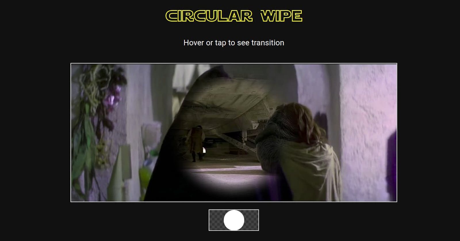
An awesome, cross-browser Star Wars circular wipe transition? CSS houdini vs clippath vs mask


Speaking of wipe animations, Will Boyd covered making CSS animations of some Star Wars wipe transitions recently. All of the animations were based on CSS masks.
CSS Masks have some issues. I will offer a couple of alternative solutions to one of his wipe animations - Will refers to it as an iris wipe transition - I will call it a circular wipe transition. I guess others may refer to it as a radial wipe transition.
Tom-a-toe, tomat-oe. 🍅😁
What is the issue with CSS Masks?
CSS masks are a bit iffy.
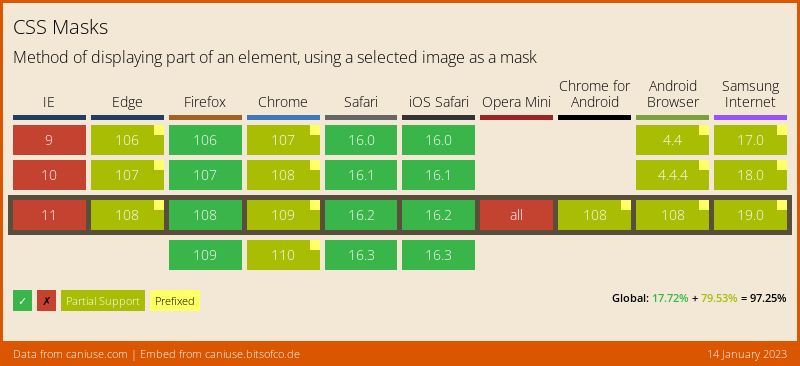
According to caniuse, masks are partially implemented in Chromium browsers. You still need to use a vendor prefix.
The advice is to favour using the -webkit-mask-image property. The rest of the spec is not fully implemented. That is quite vague.
I guess that this means that you can't specify properties such as mask-size, mask-position, and mask-repeat. From what I seen you can use the prefixed version of these properties in some contexts in Chrome, but it may not behave as you expect.
Will Boyd animates -webkit-mask-position successfully for his horizontal wipe transition example - from -webkit-mask-position: left; to -webkit-mask-position: right;. So, you can animate the position of a mask, but to varying degrees of success I guess. The same goes for the size of a mask.
If you use a gradient as the mask source, you cannot animate it as a gradual transition where it is based on interpolated values. It is a discrete type of animation. It will jump from one state to another. That is how it is specified, sothat is not an implementation blooper. I doubt that you would want that type of animation though!
CSS Houdini does open the door to animating a gradient mask source as a gradual transition - you can use the CSS Properties and Values API. However, Houdini is only supported in Chrome and Edge right now.
The bottom line is that you can't specify and animate masks freely, and expect it to work across all browsers.
Let's get into the circular wipe transition.
Using CSS Masks to create the circular wipe transition
Will Boyd uses the CSS Properties and Values API to animate the gradient mask as below:
@property --radius {
  syntax: '<percentage>';
  inherits: true;
  initial-value: -5%;
}

@keyframes scene-transition {
  to { --radius: 105%; }
}

.scene-2 {
  background-image: url(scene-2.jpg);
  z-index: -1;
  -webkit-mask-image: radial-gradient(
    circle,
    #fff calc(var(--radius) - 5%),
    transparent calc(var(--radius) + 5%)
  );
}

.scenes:is(:hover, :focus) .scene-2 {
  z-index: 1;
  animation: scene-transition 2s linear forwards;
}
Here is the codepen:
As stated, this only works in Chrome and Edge at the moment.
There is a fallback included for this animation, the images will be swapped using z-index. You can try this in Firefox or Safari to see that happening.
You could treat this as a progressive enhancement. If you must have a consistent outcome, you got to look at other solutions. Read on if you are interested in that.
Is there a cross-browser solution for a circular wipe transition?
For this effect, you could animate the -webkit-mask-size property instead of using the CSS Properties and Values API. Set the initial mask size to zero and then tween it to 100% on hover. I tried it and it doesn't appear to work properly in Chromium browsers, but in any case we would like to see alternatives that have more predictable outcomes.
Use clip-path instead of mask
You can use clip-path instead of -webkit-mask-image. The limitation is that you cannot have semi-transparent areas, you will need forgo the featured edges. The advantage is that the clip-path property has evergreen support for basic shapes and you can animate the shape in a gradual transition.
We will use a circle shape through the circle() function. We will change the radius of the circle from zero to a larger size to expand the circle to reveal the second scene image.
The simplest way to visualize the animation is by opening clippy CSS clip-path maker, and play with the circle shape. You can play the video demo below to grasp the idea.
If you look at the bottom of the video (probably covered by the controls), you can see the CSS snippet change. The first value in circle() - the radius - is reduced from 50% to 0%. This makes the image disappear.
We want to do it the opposite way round for our animation, go from 0% to 85%. The value is bigger than 50% because we want to reveal the entire image and we need a circle that exceeds the bounds of the image for that to happen.
Here is the CSS:
.scene-2 {
  clip-path: circle(0% at 50% 50%);
  background-image: url("img/scene-2.jpg");
}

@keyframes scene-transition {
  100% {
    clip-path: circle(85% at 50% 50%);
  }
}

.scenes:is(:hover, :focus) .scene-2 {
  animation: scene-transition 2s linear forwards;
}
This definitely works in Chrome and Firefox, and should work in Safari (tell me if it doesn't):
This appears to be an evergreen solution. If you need some transparency, then look into the next method.
Use a SVG mask
If you want some semi-transparent areas, then you can opt for a SVG Mask. It is better supported than CSS Masks.
It is a bit more work, but you can get a good result that should work across all browsers.
I found it easiest to create a SVG with a viewBox that has the same dimensions as the scene-2.jpg, which is 1920px by 820px. We give the viewBox a width of 1920 units and height of 820 units i.e viewBox="0 0 1920 820".
I created a mask element that contains a circle element. We are provided the same set of values as we did for the clip-path. We position in the center, so the cx and cy values are 50%. The mask radius - the r attribute - is give a value of 410, which is 50% of the height.
We create an image element for scene-2.jpg, that covers the entire canvas. We apply the mask to it. If you want soft edges, you can create a radialGradient and apply that to circle contained in the mask. It sounds a bit weird to explain it all. Probably best to look at the markdown below:
<svg xmlns="http://www.w3.org/2000/svg" class="scene-2 scene" viewBox="0 0 1920 820">
  <defs>
    <radialGradient id="myGradient">
      <stop offset="70%" stop-color="white" />
      <stop offset="100%" stop-color="transparent" />
    </radialGradient>
    <mask id="imageMask">
      <circle id="circleMask" cx="50%" cy="50%" r="410" fill="url('#myGradient')" />
    </mask>
  </defs>
  <image width="100%" height="100%" preserveAspectRatio="xMidYMid slice" href="https://raw.githubusercontent.com/robole/artifice/main/star-wars-circular-wipe/assets/img/scene-2.jpg" mask="url(#imageMask)"></image>
</svg>
This is how the SVG will look:

For the animation, we change the size of the circle element that is contained in the mask. We want to set the intial size to be zero and then increase it to expand beyond the boundaries of the canvas. We can use a scale() transformation to do this.
.scenes:is(:hover, :focus) #circleMask {
  animation: scene-transition 2s linear forwards;
}

#circleMask {
  transform: scale(0);
  transform-origin: center;
}

@keyframes scene-transition {
  to {
    transform: scale(4);
  }
}
Here is the codepen:
You do need to have a good grasp of SVG to pull this off, but it looks like it works well across browsers.
Conclusion
I would be wary with animating masks. I would favour animating clip-path when you do not need semi-transparency - the browser support is much better. If you want an animation with semi-transparency, you could use a SVG mask instead of a CSS mask. This works well but it requires decent SVG knowledge and a bit more effort.